
Be yourself; Everyone else is already taken.
— Oscar Wilde.
This is the first post on my new blog. I’m just getting this new blog going, so stay tuned for more. Subscribe below to get notified when I post new updates.
Be yourself; Everyone else is already taken.
— Oscar Wilde.
This is the first post on my new blog. I’m just getting this new blog going, so stay tuned for more. Subscribe below to get notified when I post new updates.
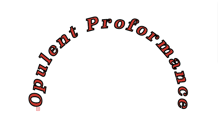
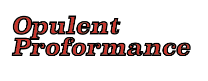
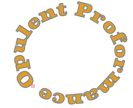
For my Brand I chose the name Opulent Performance. For the first logo design I chose to do my lettering in a bight red and I used the type on a path tool to achieve that aesthetic. For my second logo I chose a simply design in which I used a bold italics font in red. I also pulled the words closer together to show a clear relationship between the two. For my last logo I used the type on a path tool again, but this time I made it in a yellow and I made it so the name of my brand would go around the circle completely. My last logo was also outlined in grey to create a new color relationship.
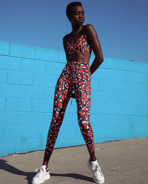
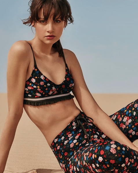
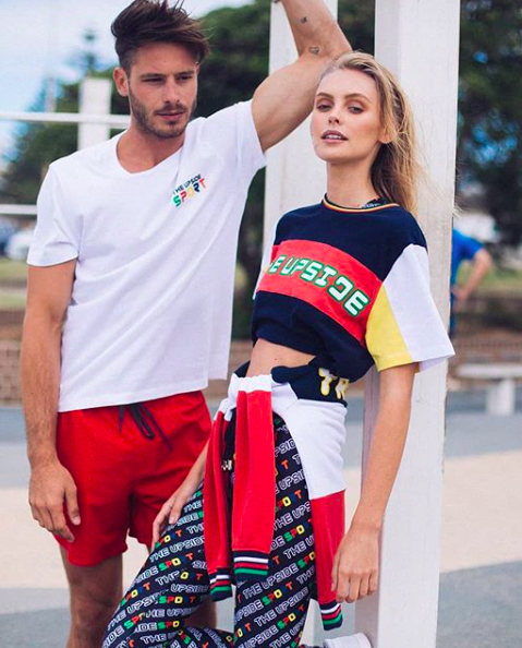
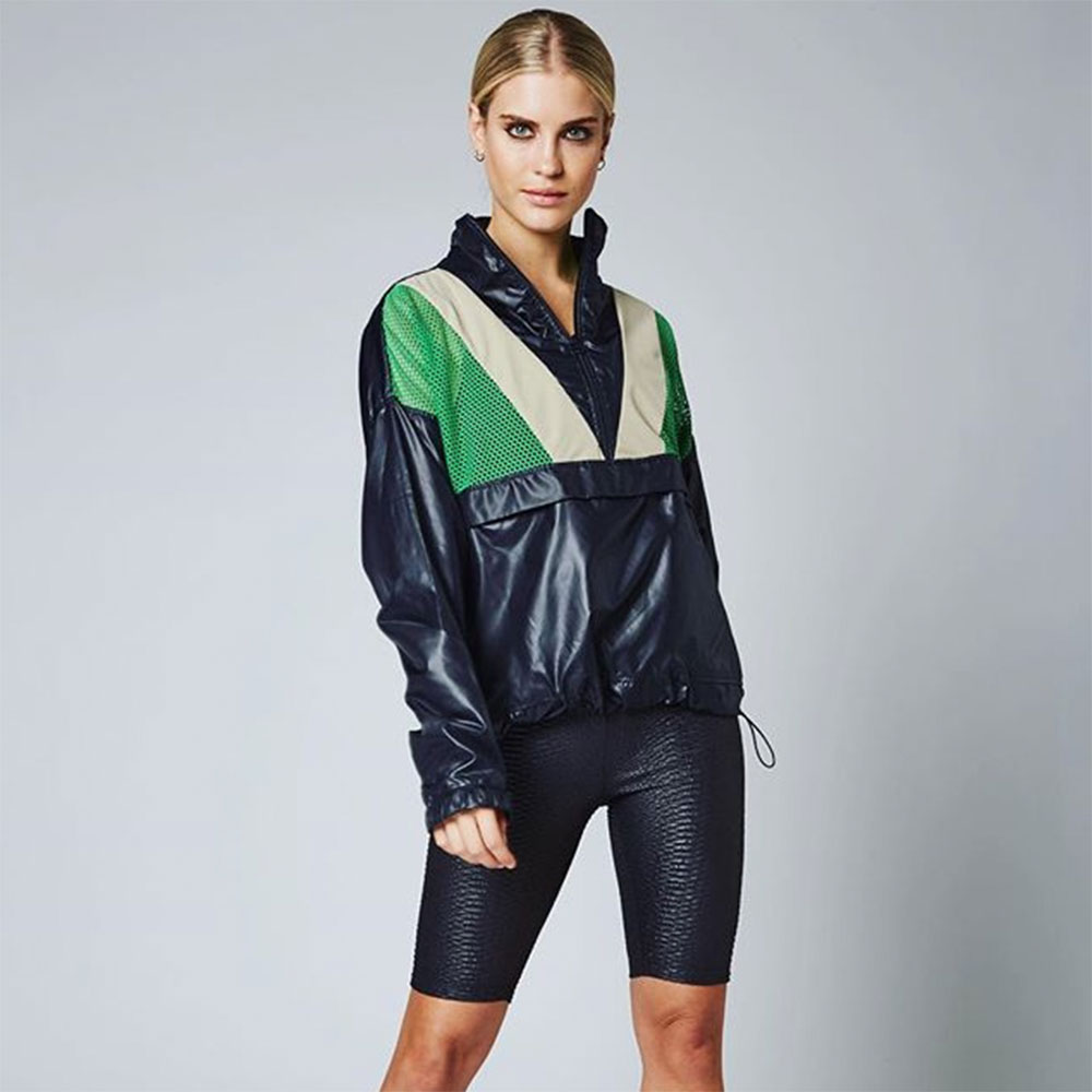
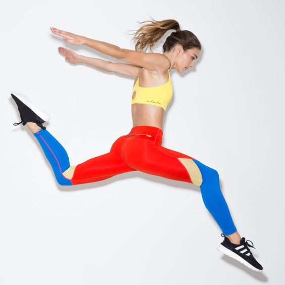
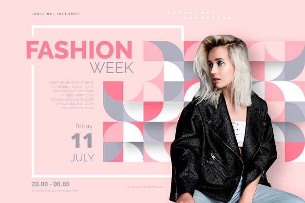
The Upside is a fairly new Australian luxury active wear label that was established by Jodhi Mears in 2014. The Upside has locations in the United Kingdom, United States, Australia, Germany, and many more places. This activewear label focuses on making fashionable yet functional apparel. The label has become increasingly popular due to its features in publications such as: Elle Australia, Vogue, Harpers Bazar, and Women’s Health.
I decided to base my future collection on this particular brand because The Upside is know for using dynamic prints, patterns, and florals in just about all of their designs. This was especially appealing because their unique mix of designs inspires me to create chic athleisure designs that resonates with the brand and my culture. Choosing a brand that focuses on more simplistic designs would make me feel limited in the designs I could create for the brand. I also liked how this brand isn’t afraid to add ruffles, cut outs, and knots, on top of their loud prints. Head turning clothing that is still perfectly functional is the concept I am after.
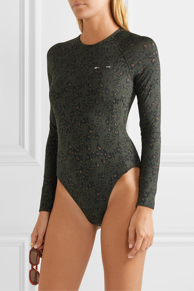
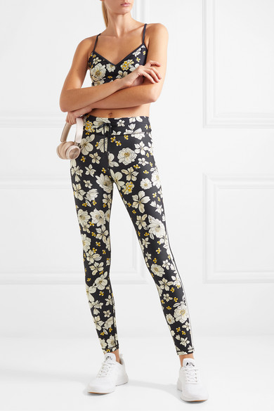
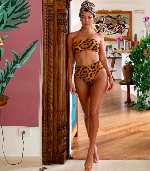
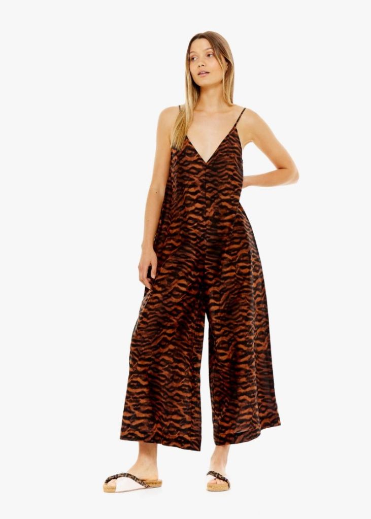
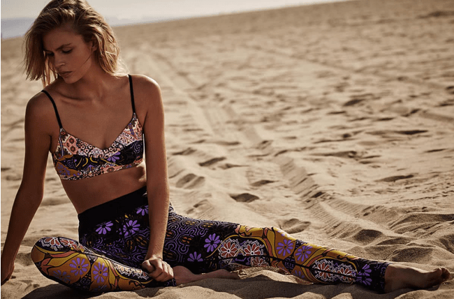
Some upcoming trends in color for Fall/Winter of 2020 include more usage of artificial bright colors and designs that incorporate an analogous color relationship. Patterns that have a trippy effect such as melted designs and unique florals are also a projected trend for next Fall/Winter. A recent development that is likely to impact activewear is the concept and design of geometric body mapping. In this concept there is a base layer of fabric that is flexible and then there is another kitted layer designed to give you improved performance and muscle support.
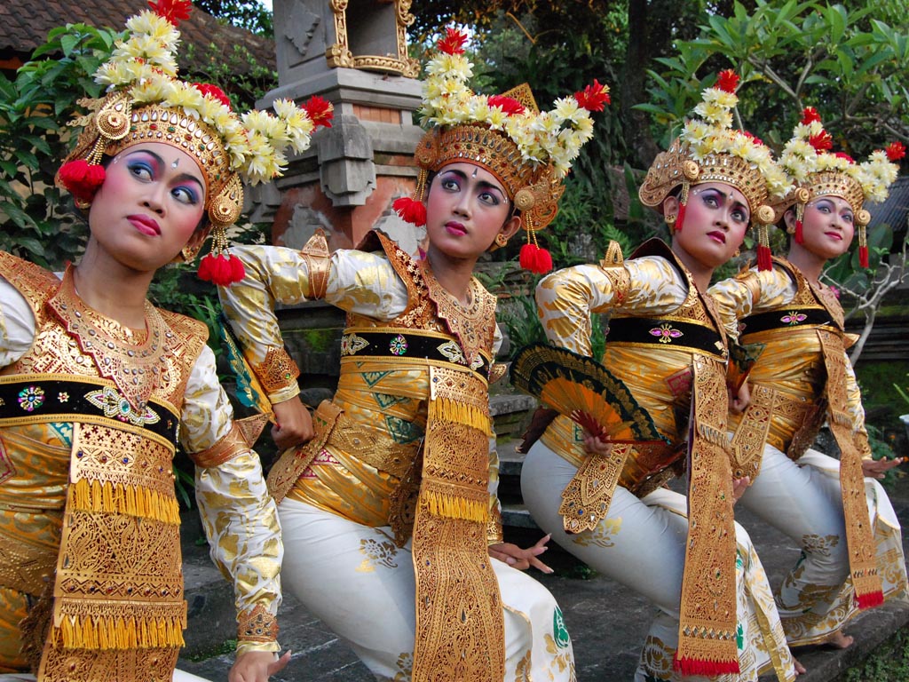
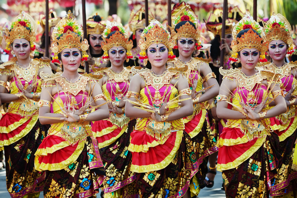
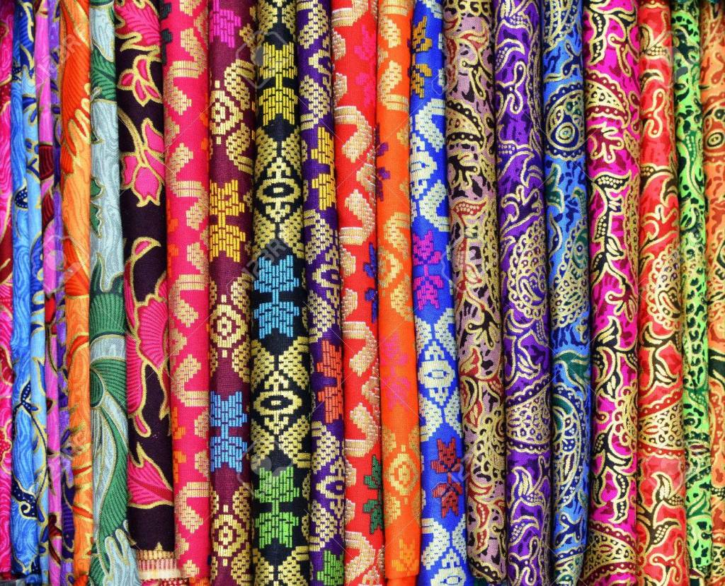
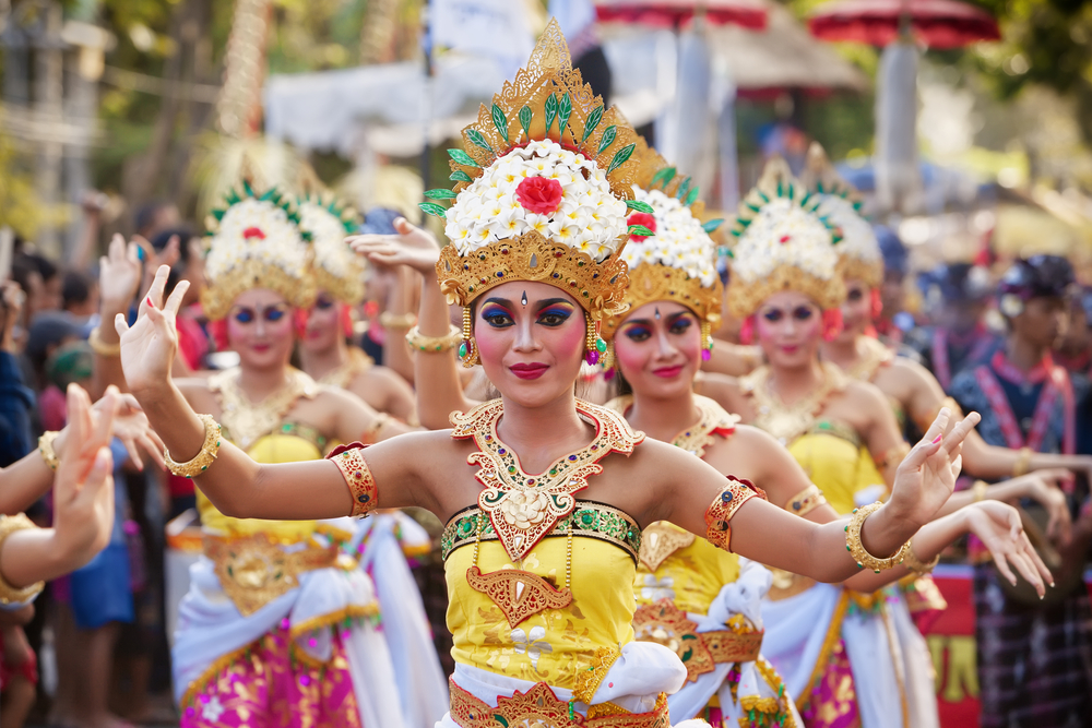
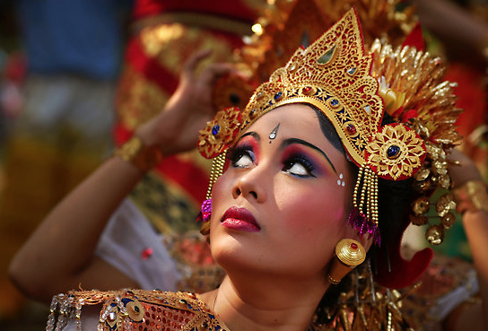
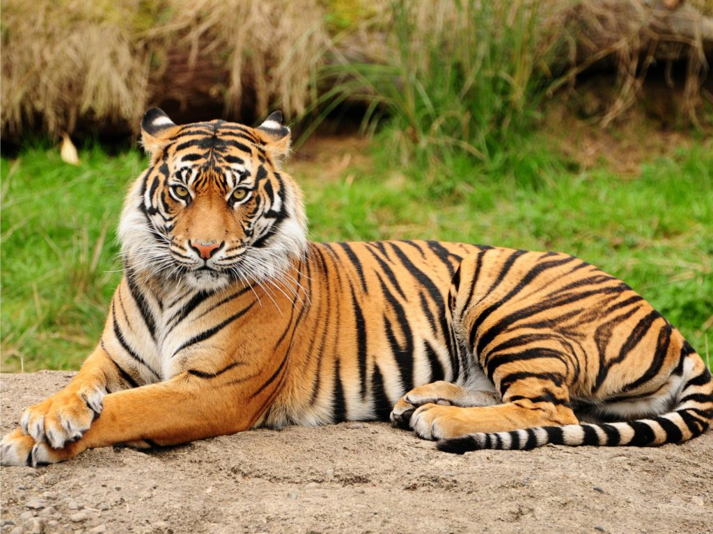
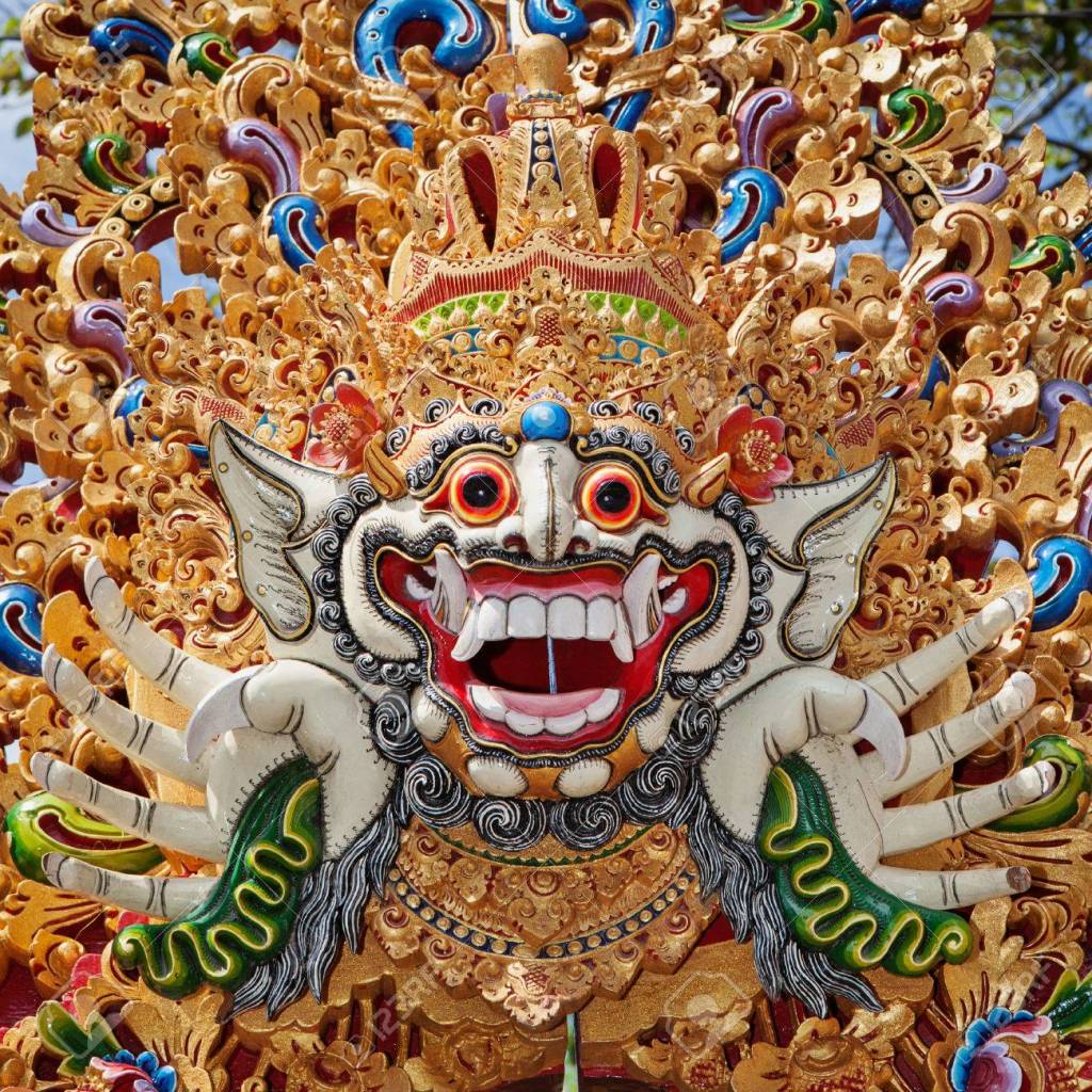
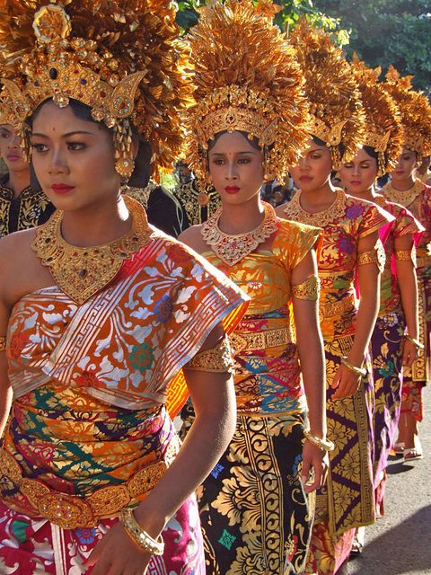
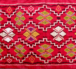
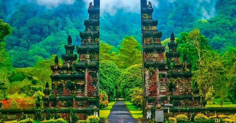
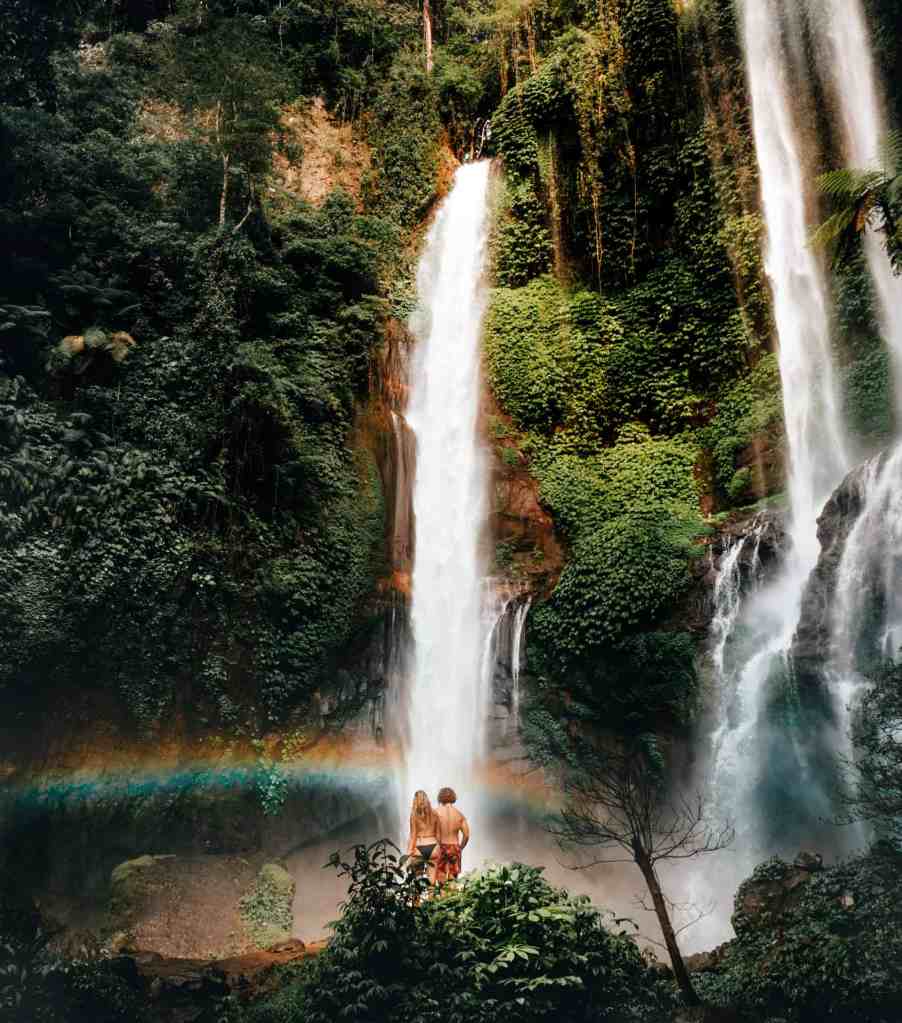
One trend that is aligned with my culture would be would be the increased usage of bright artificial colors. Bold colors like reds and greens are ingrained in Bali’s cultural and traditional apparel. I would incorporate this trend by having my prints and patterns done in eye-catching hues. Another Fall/Winter 2020 trend that aligns with my culture would be creating new exciting looks by using mixed textures. The dresses of traditional Balinese women often times have many different elements including: intricate beading, metallic headdresses, and occasionally fringe. I would incorporate this by using more mixed media in my designs. My last activewear trend would be the geometric body mapping. There are many facets of Bali’s culture in which geometrics are involved including their architecture and ceremonial clothing. I plan to compose my prints primarily of geometrics, so they relate more to my culture
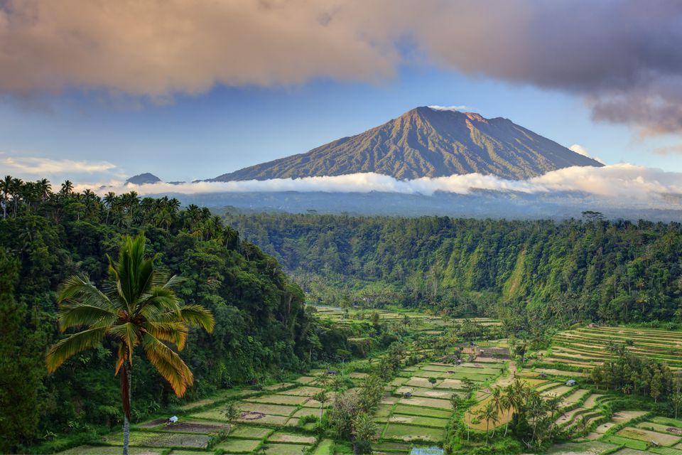
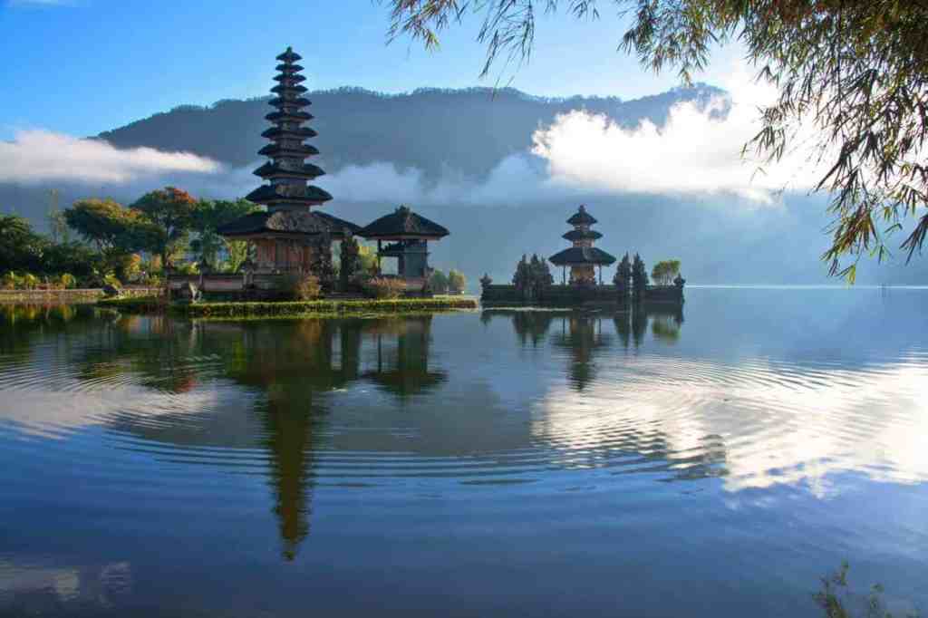
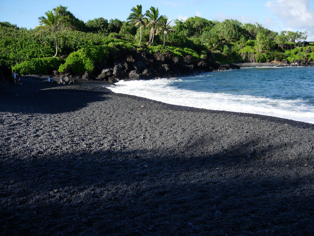
Learning about the culture
Textile and color Info.
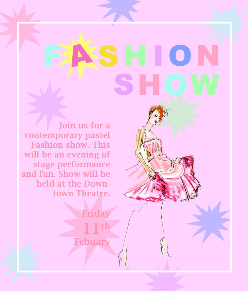
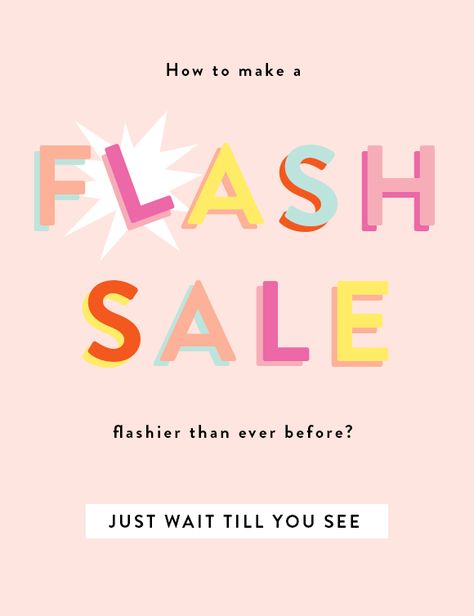
Repetition- An aspect of my poster that shows repetition would be my shapes in the background. These constant shapes make my poster more cohesive.
Alignment- All of my text including my Title has a right alignment to keep it all neat and organized.
Proximity- I grouped my main text with my clipart, because they both relating to pastel fashion. This helps show a clear relationship between the two.
Contrast- I had a couple different contrasting elements in my poster. In my title I made each of my letters different colors to grab the attention of the viewer. I also added a white border around my text to bring the viewers focus inward and break up some of the color.
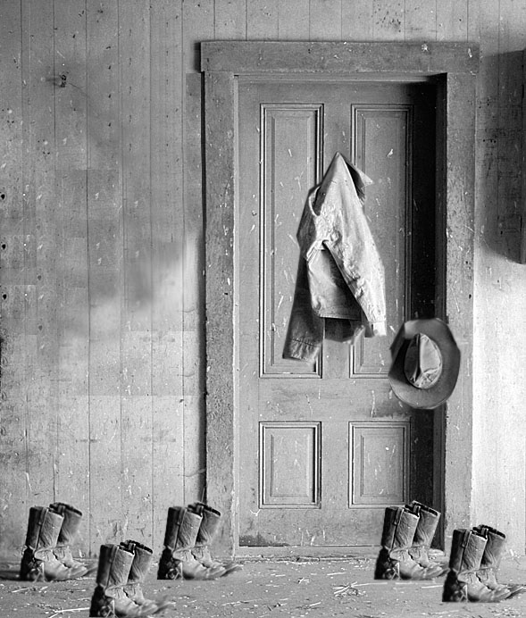
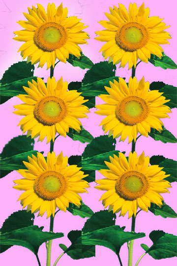
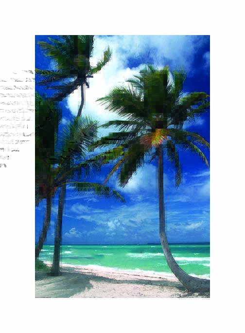
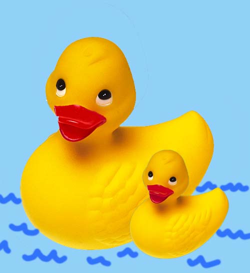
I used the brush tool in my Ducky post to create little blue waves in the water. In my Palm tree picture I used the eraser background tool to erase the hammock in between the palm trees. For my Sunflower garden I lightened my flower and its leaves with the dodge tool. In my ranch house picture I used the blur tool to soften the edges of the copied items to make them look more realistic.
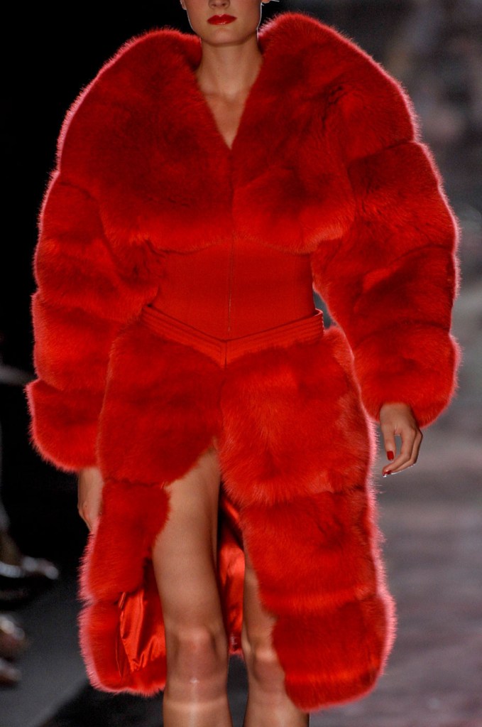
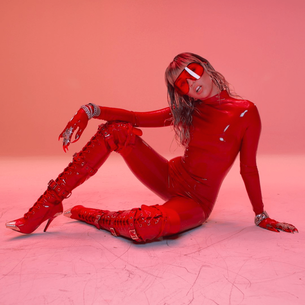
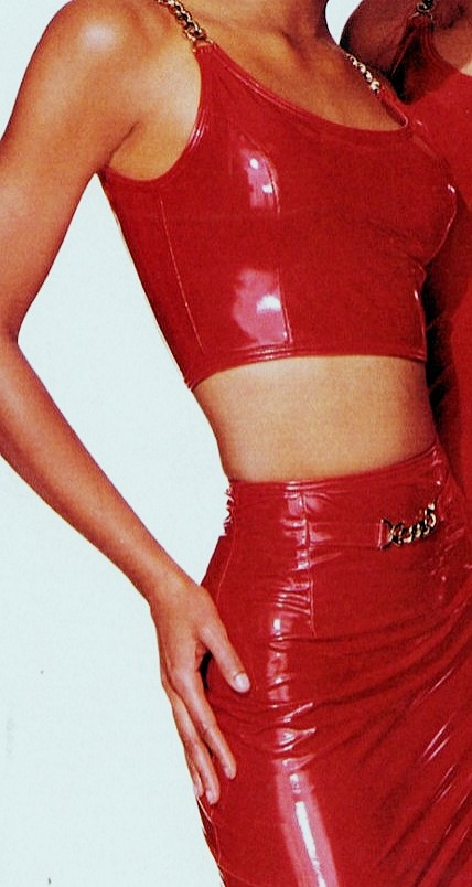
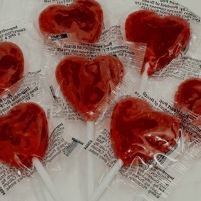
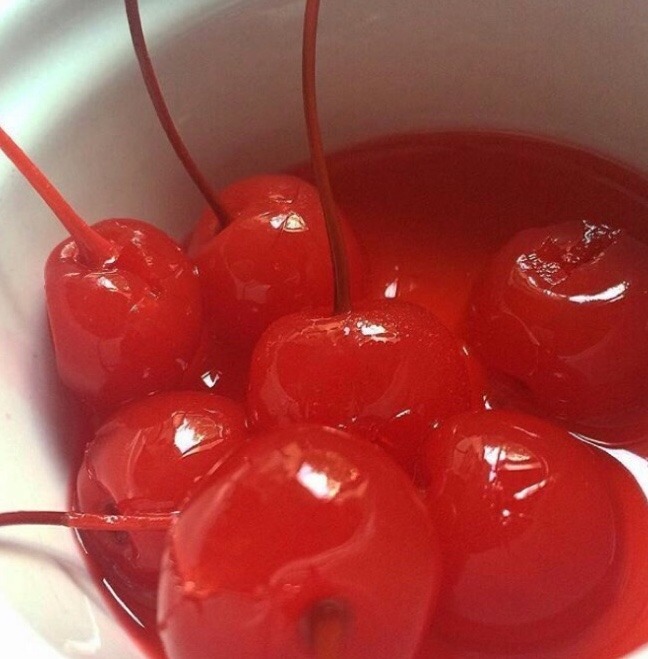
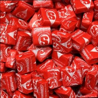
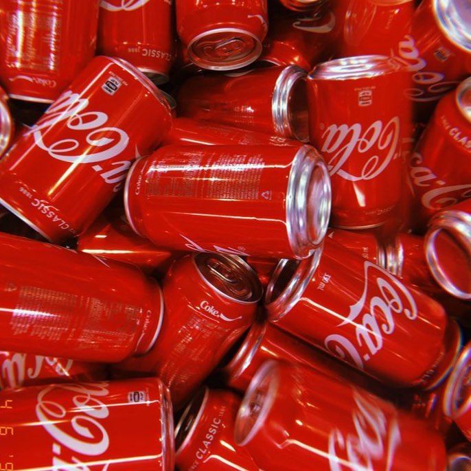
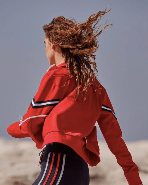
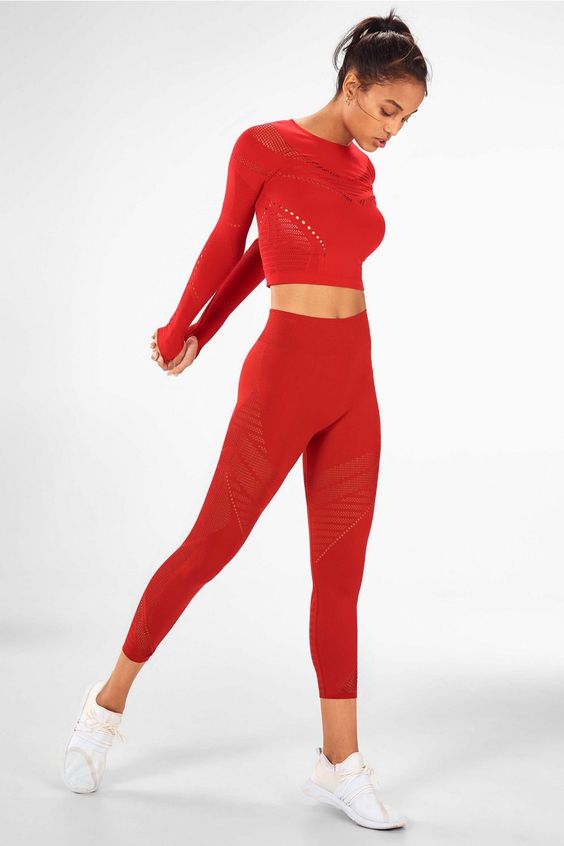
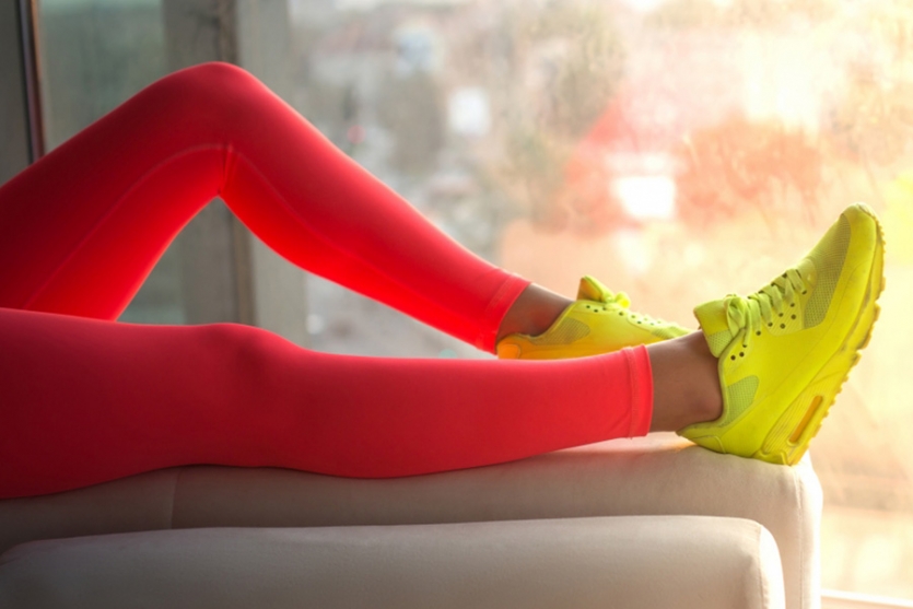
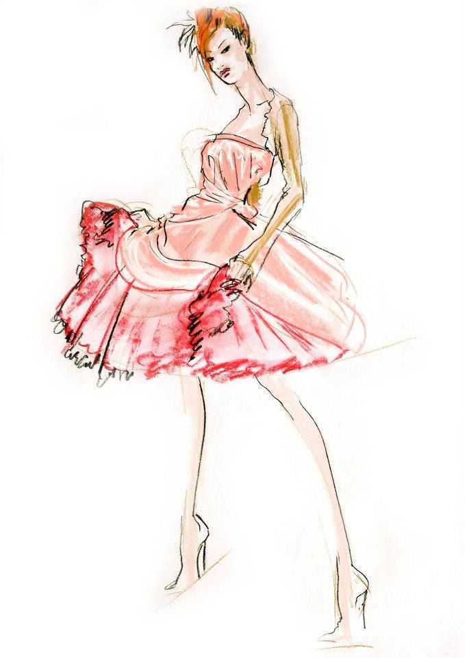
This monochromatic color relationship appealed to me because of how bright and eye-catching it is. I have always loved the color red because to me it signifies energy, passion, confidence, courage, and power.
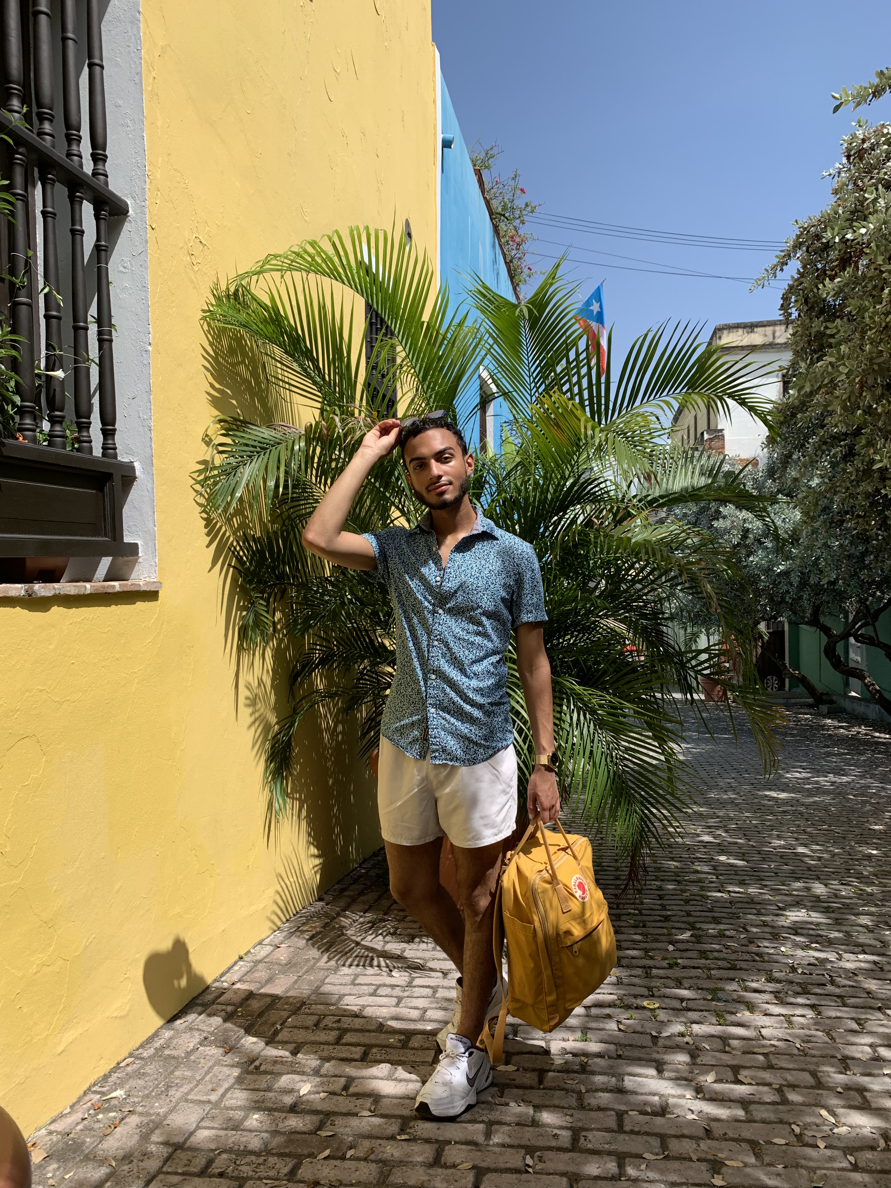
Hi my name is Xavier and welcome to my blog Xpress Fashion! I chose this name for my blog because fashion is a very expressive way to tell people about who you are. I also feel it’s one of the best ways to show people who you are without saying anything at all, but since you can’t make an inference on who I am through the computer screen let me tell you about myself.
I’m twenty years old and I recently moved here from Virginia Beach. I spent the majority of my life in the 757, but my family and I are originally from the Dominican Republic. My cultures passion, bright colors, and sheer expressiveness influences my style as well as all the all other facets of my life. I’ve also worked as a stylist at Michael Kors for about the past two years. Through that job I learned so much about high fashion, clienteling, and styling all sorts of personalities.
My favorite part of that experience was being able to show people how to embrace and express their own style. That is exactly what I hope to do for all my subscribers, so stay tuned for more!
More Info.
