
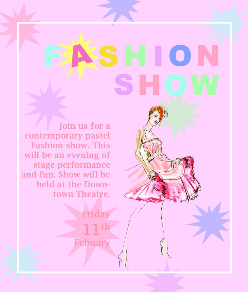
Repetition- An aspect of my poster that shows repetition would be my shapes in the background. These constant shapes make my poster more cohesive.
Alignment- All of my text including my Title has a right alignment to keep it all neat and organized.
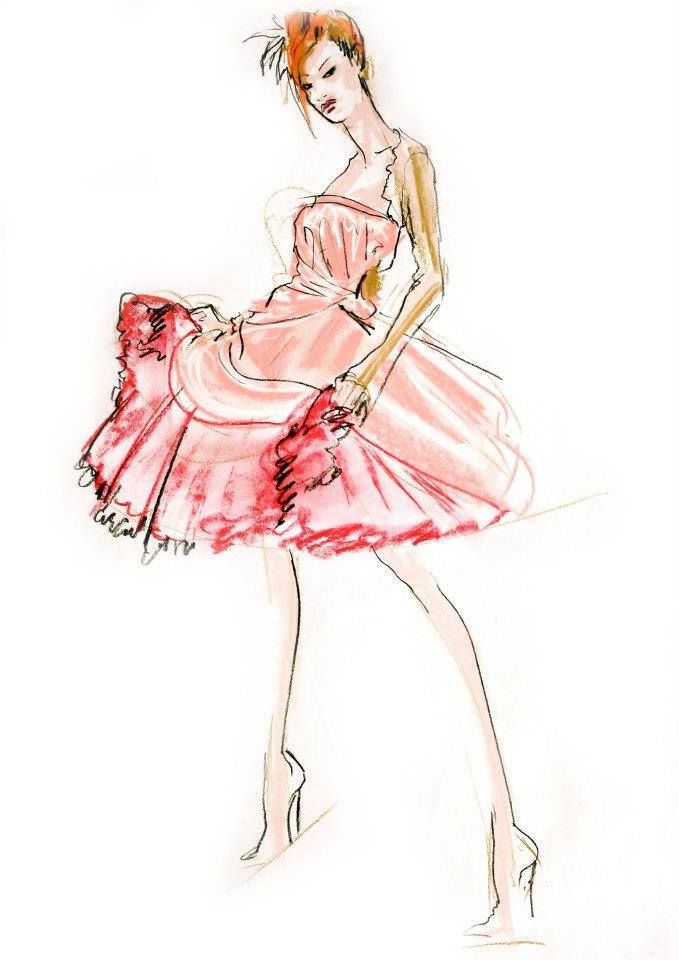
Proximity- I grouped my main text with my clipart, because they both relating to pastel fashion. This helps show a clear relationship between the two.
Contrast- I had a couple different contrasting elements in my poster. In my title I made each of my letters different colors to grab the attention of the viewer. I also added a white border around my text to bring the viewers focus inward and break up some of the color.
