
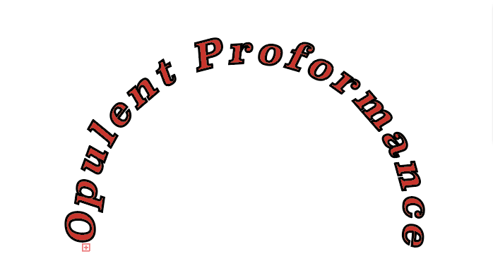
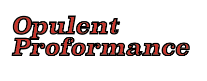
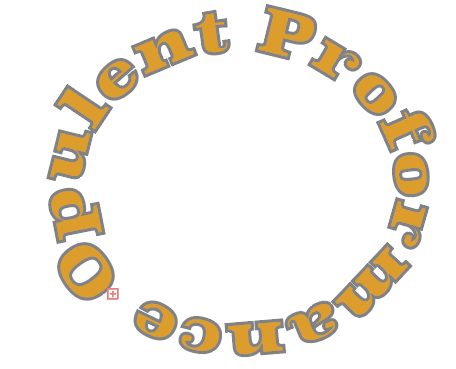
For my Brand I chose the name Opulent Performance. For the first logo design I chose to do my lettering in a bight red and I used the type on a path tool to achieve that aesthetic. For my second logo I chose a simply design in which I used a bold italics font in red. I also pulled the words closer together to show a clear relationship between the two. For my last logo I used the type on a path tool again, but this time I made it in a yellow and I made it so the name of my brand would go around the circle completely. My last logo was also outlined in grey to create a new color relationship.
